

A form asks for a name, email address, phone number, company, project description and billing address before anyone has explained what happens next. Some of those details may be useful eventually. That does not make every one of them necessary for the first enquiry
Choosing mobile enquiry form fields starts with the response your business needs to make. Ask for enough information to understand and route the request, give the visitor a workable reply method, and keep later-stage questions out of the way until they have a clear purpose
This ADAMS guide is for owners and marketing teams reviewing a service enquiry form. The workshop-provider example is fictional and illustrates content decisions, not an available ADAMS service, a client project, a working form or measured results
The main image is a conceptual illustration of digital form fields, not a working form, a client project or measured results
Start with the response the form is meant to support
Complete this sentence with the person who handles enquiries: “When this request arrives, we need to decide whether to…” The next step might be routing it to the right colleague, checking service suitability or arranging a conversation. A first enquiry does not always contain enough information to prepare a final quotation
Then identify the information needed for that decision. If coverage depends on the project location, an area or city may matter immediately. If the team can first assess a general request without a full postal address, that address may belong later. Use the real service process rather than copying another company’s form
The explanation before the form matters too. A visitor should already understand the service, its important limits and what sending the request does. Our B2B service-page content guide covers those earlier buying questions
Give each field a job before making it required
For each proposed field, record who uses the answer, which initial decision it changes, and what happens if the visitor cannot provide it. “It could be useful for marketing” is not the same reason as “we cannot identify the requested service without it”
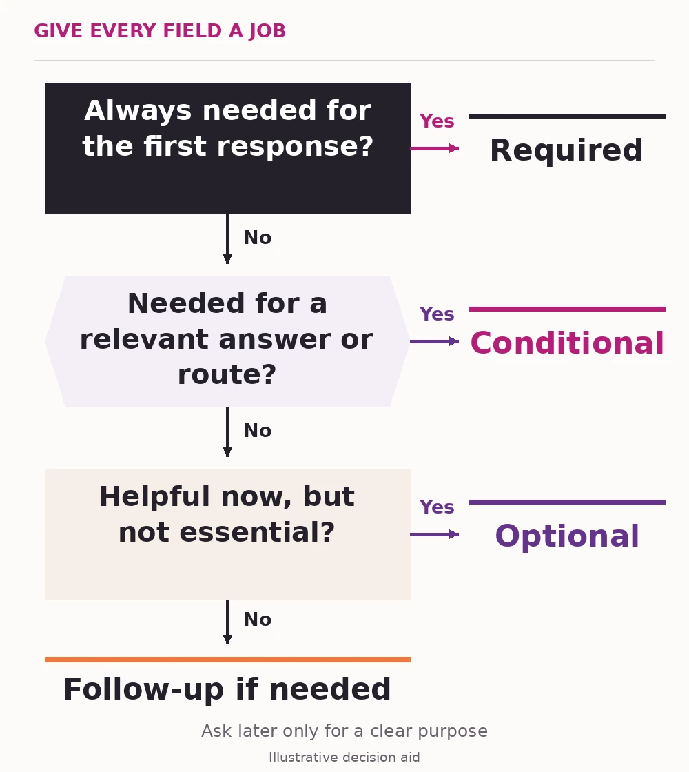
Separate the answers into four groups. Required information is genuinely necessary to handle this first request. Optional information can help but its absence does not prevent the next step. Conditional information is needed only for a relevant answer or route. Follow-up information belongs after the team has reviewed the enquiry and explained why it is needed
The GOV.UK question-page guidance recommends knowing why each question is being asked and requesting only information that is needed. Apply that principle to your business process; a short commercial enquiry does not automatically need the same page structure as a government service
Choose a reply route the business actually supports. If email or a call can each support the next conversation, asking the visitor to choose one may be appropriate, with the corresponding contact detail required. Do not demand both by habit. If both are necessary for a particular process, explain their separate purposes and confirm that requirement with the responsible team
Worked example: a workshop enquiry, not a booking
Fictional example: a provider reviews requests for company workshops before checking suitability and agreeing content or dates. Its first form is meant to understand the need and enable a reply. It is not a checkout or a confirmed reservation
The initial enquiry
A useful starting question is “What would you like the workshop to help your team do?” A short explanation of the need gives the reviewer context. A broad “Message” label provides less guidance, while a compulsory technical specification could demand decisions the buyer has not made
The form can then ask which supported reply route the visitor prefers and show the relevant email or phone field. It can ask whether the workshop is being considered remotely, at a workplace or with the format still undecided. The city question appears only where location is needed to assess an on-site request
The company name and preferred timing can be optional if the provider can make its initial response without them. If timing is essential to the first availability check, the real form needs a suitable way to explain uncertainty rather than forcing an invented date. These choices depend on the provider’s process; they are not a standard field list for every service
What can wait for follow-up
Billing details, a final participant list and the detailed workshop plan are different tasks from deciding how to respond to an initial enquiry. Ask for them later when their purpose and the next step are clear. Do not invite confidential personnel information or unrestricted document uploads merely to make the form look complete
An action such as “Send workshop enquiry” describes this example accurately. The nearby explanation should say that the team reviews the request before confirming arrangements. The form should not describe sending an enquiry as booking a session or receiving an agreed quotation
Write labels that let people answer
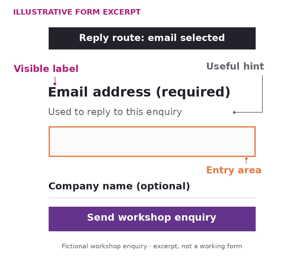
Use a visible name for every field and keep it available while the visitor types. A temporary hint inside an empty box should not be the only explanation of the question. Give the developer the approved labels as part of the content, so they can be associated correctly with the controls, as described in W3C’s form-labelling guidance
State which information is required and which is optional in words the visitor can understand. Add a short hint only when it resolves a likely uncertainty, such as why the location is requested or which contact route will be used. W3C’s form-instructions guidance covers required and optional input, expected formats and relevant help
Give people a truthful answer where they have not decided yet. “Not sure yet” can be useful when uncertainty is valid and the team can still respond. It should not hide a mandatory safety, eligibility or service requirement; the responsible team must decide which answers allow the request to proceed
Review Arabic wording as actual interface copy, with the field label, hint, action and error together. Keep the meaning equivalent in English without forcing identical sentence lengths. Check phone numbers, email addresses and punctuation in the actual right-to-left layout rather than treating right alignment as a complete language review
Design the mobile task, including the awkward moments
Keep the reading and input order clear and check it with the on-screen keyboard open. Can the visitor still see the current question, move to the next field, correct an answer and reach the action? A floating contact button or sticky banner must not cover a field or the submission control
Ask the developer to use suitable field types and autocomplete where appropriate, then test their behaviour on real devices. web.dev’s form-attribute guidance explains how input types can affect the mobile keyboard and validation, while a keyboard hint alone does not validate the value. A telephone field should not be treated as a quantity
Conditional questions need the same review. Change the selected reply route and check that the form does not still require the hidden contact field. Return to an earlier answer and confirm that the visible questions, instructions and required state remain consistent
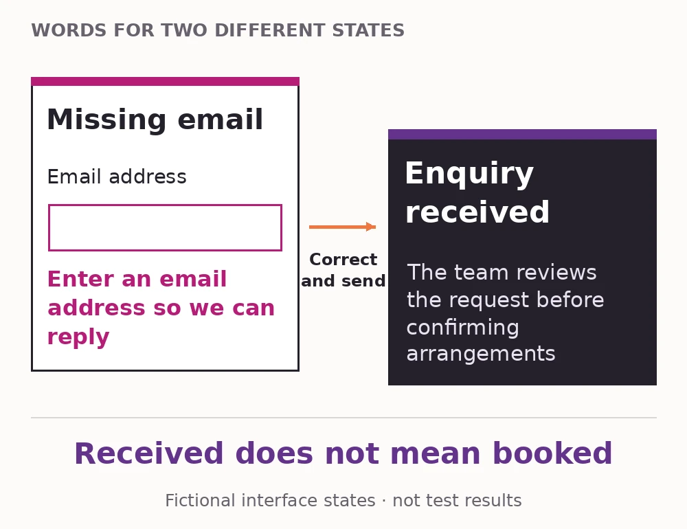
Make error messages specific enough to act on. For a required email field left empty, “Enter an email address so we can reply” tells the visitor more than “Invalid input”. Keep valid answers available where appropriate after an error, and make the problem understandable without relying only on colour. W3C’s form-notification guidance explains clear error feedback and confirmation of the submission result
Check the enquiry through to receipt
Agree an authorised test with the person receiving requests and label it clearly. Complete the form on a phone and with a keyboard, trigger a recoverable error, correct it, and check the result. Verify the actual receiving destination and the person responsible, rather than stopping at the screen’s success message
The confirmation must describe the state the system can establish. A received or accepted enquiry is not a confirmed booking, agreed scope or promise of a reply time. Use a response expectation only when the business has approved it and can meet it. If the request disappears after submission, our enquiry-journey diagnostic covers that wider delivery investigation
Review the missing information, not the field count
After release, ask the enquiry handler which missing details repeatedly prevent a useful first response and which questions visitors struggle to answer. Review those observations alongside the relevant page and form behaviour, with the period and any other changes recorded. Abandonment alone does not identify the cause, and a completed form does not prove that the request is suitable
A shorter form is not automatically a better form. Add, clarify, make optional or defer a question for a reason you can explain, then review the result. Keep an owner for the questions and revisit them when the service, coverage or response process changes
For your next review, bring one form, the initial decision it supports and the information the receiving team actually needs. ADAMS website design work can be scoped around that task, with content, implementation and delivery checks agreed before changes begin. Share the page and the first response your team needs to make