

A campaign can use the right logo and colours yet become difficult to recognise across its posts, stories and website. A headline is squeezed into a narrow space, the image loses its useful detail, and a graphic that looks like a button does not take the reader anywhere
A campaign design system sets the rules that connect those applications while giving each layout room to work. For a marketing manager commissioning several formats, the useful decision is what must remain consistent, what can change and how the finished placements will be checked together
Main image: Educational concept of fictional digital campaign layouts, not a client project, published advertisement or actual product specification
Start with a shared message and a real next step
Write the campaign’s task before choosing the layouts: who should notice it, what they should understand and what they can do next. Keep the approved message and its factual limits alongside the brand files. If the offer or audience changes between formats, the problem needs a content decision as well as a design correction
List the actual uses rather than requesting “all social sizes”. Record the channel, whether the placement is paid or unpaid, the language, the destination and the type of asset required. A still image, a video and a website section are different production tasks, even when they share a campaign idea
If those decisions are still open, use the marketing brief guide to resolve them first. Here, the job is to translate an agreed direction into a usable family of digital applications
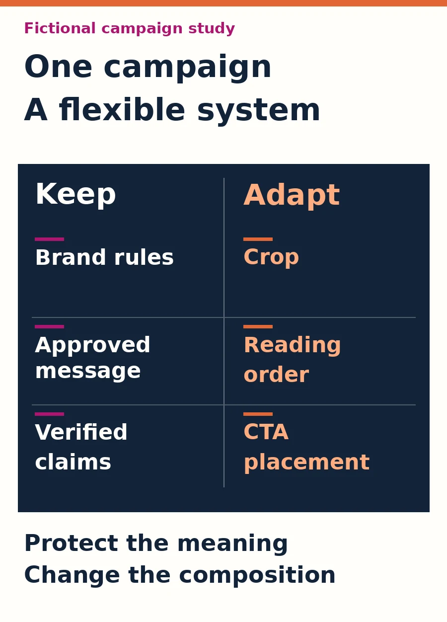
Separate the rules to preserve from the layout to adapt
Keep the current approved logo variants, colour roles, type choices, tone and message boundaries available to everyone producing the work. Define their use: a colour might identify the main action, while a secondary colour highlights a supporting detail. “Use the brand colours” leaves those priorities undecided
Then identify what the designer may adapt: the image crop, position of the subject, line breaks, spacing, balance between text and imagery, and the amount of supporting explanation. The important relationship is the order of attention: which message is noticed first, which detail supports it and where the next action appears
IBM’s layout guidance discusses how repetition and variation work together. For this campaign task, preserve a clear visual relationship between applications while allowing a different composition where the space or reading context requires it. This is a design principle, not evidence of improved campaign performance
A shared set of files helps the team apply those rules. For example, Adobe Express supports brand collections containing logos, colours, fonts and graphics. Whatever tool you use, identify the approved version and explain the decisions; access to the right assets alone does not settle the layout
Recompose the same campaign for each use
Consider a fictional company introducing an industrial component catalogue. The common heading is “Industrial components”, and the invitation is “Discuss your project requirements”. The unbranded component image and copy are illustrative, not a client project, a real catalogue, a technical specification or proof of availability or compatibility
The campaign keeps its subject, visual character and enquiry purpose. Each application below changes the arrangement to suit its job; the business would need to confirm the actual offer, permissions and contact process before using it
A feed post: make the subject and message readable together
Give the component enough space to remain identifiable and set the short heading where it can be read during ordinary browsing. A different crop is useful only if it preserves the detail the picture is meant to show. Do not squeeze extra specifications into the image simply because there is unused space
Put the fuller invitation in the accompanying post text, with an available contact route that matches the instructions. Do not present a painted button inside an ordinary image as though it were an independent working control. If the chosen advertising format provides an action button, configure that actual control and check its destination

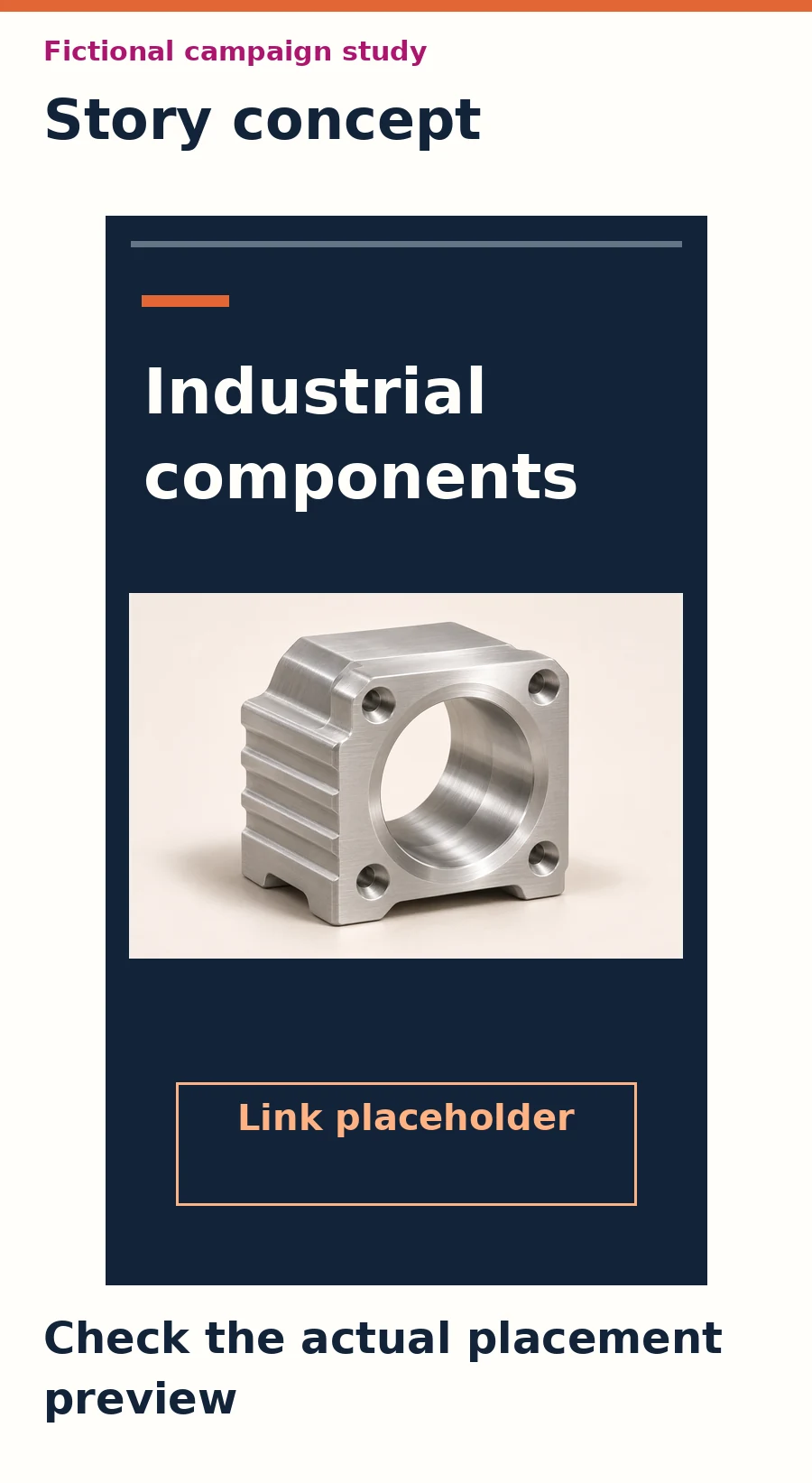
A story: rebuild the vertical composition around the interface
Move the subject and heading into a deliberate vertical arrangement instead of stretching the feed design. Keep the main message clear of the areas occupied by the selected platform’s profile information, captions and controls. A background can extend to an edge while the information that must be read stays in a reviewed area
Use the real link feature or advertising control available for that account and placement, with an accurate label and destination. Leave space for it in the composition. Drawing a control into the artwork does not add that function, and an available feature in one placement should not be assumed available in another
A website section: keep the message and action usable as the page changes
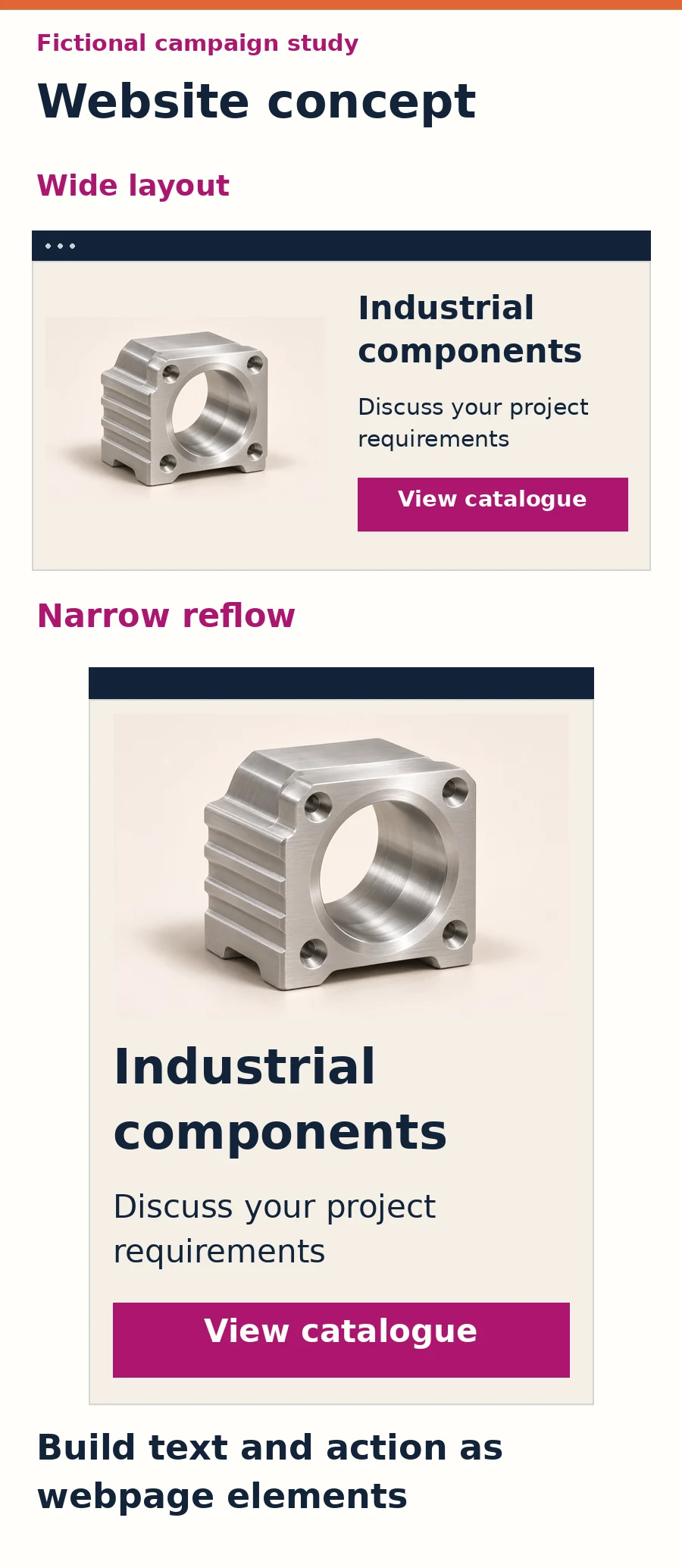
Use the same visual subject beside a real heading, a brief explanation and a link or button such as “View catalogue”, if that catalogue actually exists. On a narrow screen, the image and text can stack in a planned reading order. The image should not have to carry the entire section as one flattened export
W3C’s guidance on images of text explains the flexibility of real text compared with image-based text. Keep the website’s essential wording in HTML, provide an appropriate image alternative and test the actual action. These choices are part of the implementation review, not a declaration of complete accessibility compliance for people with disabilities
Check cropping and interface coverage in the actual placement
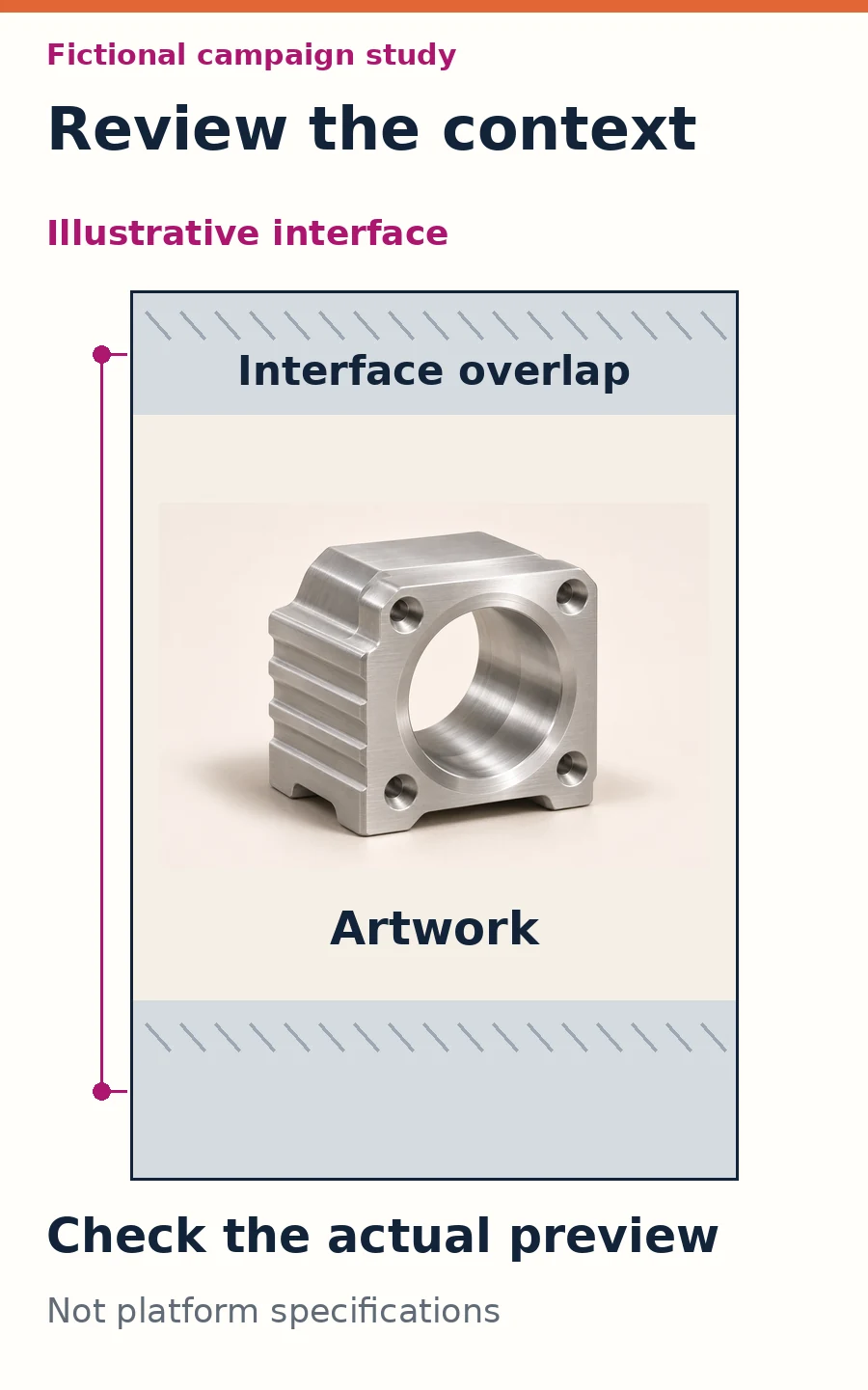
A file can have the expected dimensions and still fail after upload. Compare the export with the placement preview: can the full heading be read, does the crop preserve the intended subject and are important details covered by interface elements? Repeat the check when the caption or selected placement changes
Use the current specification for the exact format. LinkedIn’s single-image ad guidance distinguishes format recommendations and warns that square and vertical images may be cropped when shared organically. An export approved for one use therefore needs another check when it is reused elsewhere
A safe zone is the area in which essential content should remain visible alongside a platform’s interface. In its reservation in-feed ad specifications, TikTok explains that this area depends on the dimensions, caption length and interactive additions, and supplies separate left-to-right and Arabic right-to-left files. Those instructions apply to that format; they are not a universal margin for every story or platform
Use the relevant current guide and preview for the actual work. Keep platform overlays separate from the artwork in the design review so everyone can see what belongs to the campaign and what the interface may add. The schematic in this article illustrates that distinction; it is not an official platform template
Typeset Arabic as its own layout
Approve the meaning of both language versions before judging their visual balance. A clear Arabic heading may need different line breaks and a different width from its English counterpart. Reposition supporting elements where needed rather than shrinking the Arabic until it fits the English text box
Read the actual Arabic words at the intended display size. Check connected letters, punctuation, alignment and the order of any model names or Latin text. Reflect the reading direction where appropriate, while preserving logos, product imagery and symbols whose meaning would be changed by mirroring
Review the hierarchy again after localisation: does the same main idea still come first, and can someone understand the invitation without searching the composition? The files should belong to the same campaign without forcing both languages into identical geometry
Approve the applications together, then inspect them individually
First place the approved exports beside one another. Check the shared message, current brand assets, image treatment and relationship between headline and action. A side-by-side review can reveal a variation that has drifted into a different offer or visual identity
Next review each application at its intended viewing size, including the phone version. Follow the actual route where there is one: open the post link, story control or website button and check that the destination continues the same message. A layout preview and a working link test answer different questions
Give feedback as an observable issue and its consequence. “The heading falls under the interface in this preview” is actionable. “Make every version identical” can remove the adjustment that made a narrow format readable. State which rule has been broken before asking the designer to change the composition
Assign approval of business claims, language, brand application and release to the appropriate people, with one person consolidating the decisions. If the offer changes during review, update the affected copy and applications together. Do not approve an outdated export because another format already passed
Hand over a working system, with its scope made clear
Keep the current source, approved exports and placement notes organised by language and use. Record the version, required destination and any dependency still awaiting confirmation. Include the logo and image usage rules, editable-file arrangements and relevant permissions within the agreed handover
Define whether the commission covers the campaign concept, individual adaptations, motion work, website implementation and publishing. They are separate deliverables that need agreement. A website mockup does not mean a live page has been built, and a vertical still does not mean a video has been produced
If the underlying identity needs a decision first, use the brand refresh or rebrand guide. For an agreed campaign, explore ADAMS Creative Design with the placements, language requirements and available assets. Share the work you need to commission so the concept, adaptations and release responsibilities can be scoped clearly